by Kim Jooha
Alexis Beauclair and Kim Jooha have talked before. This was part of my interest in bringing them together– For years Alexis has been making some of the most inventive works in comics that both subvert and champion the form. At the same time, Kim is one of comic’s great insightful minds, able to rend meaning from the most challenging works as easily as a child does an Archie Double Digest. As mentioned, their lives in comics have brought them together in the past, perhaps most notably with Kim serving as editor on Beauclair’s book “Vanishing Perspective“. For BD à BC, Alexis and Kim talked via email about Beauclair’s collection “Freefall”, forthcoming from Breakdown Press.
–Jarrett Evan Samson

KJ: Alexis, you have created Sci-fi comics since the beginning of your publishing career. What drew you to sci-fi?
AB: Sci-fi is not a goal for me, I would like it to don’t fit into any genre (without all this absurd futuristic technology that will be so cheesy just a few years later 🙂 ). I’m driving toward a no-genre where there are just human bodies (indefinite people) interacting with/in elements or physical laws.
A kind of comic that could be read in various areas of the world and time.
KJ: Even though they have narratives unlike your more minimalist & formalist comics like LOTO (Editions Matiere) or Vanishing Perspective (2dcloud), they still do not have dialogue. Why do you hate dialogue? (just kidding 😂) But on a more serious note: why no dialogue? Is it your practice philosophy? I do love that there is no dialogue, I think it causes the readers to be more active and immersed in your work — but that’s my opinion. I am curious about your reasoning!

AB: I love many comics with dialogue but I feel there is something that always disturbs me– during the reading, I feel my eyes are directly jumping on the words. And I feel the drawing is only in my external visual focus, (you know, when like you are focusing on something in front of you but you also see what is around it, even if your eyes are not jumping on it). It’s like the art is in the second layer, less important, just giving a background atmosphere to text, a context. And when I feel this, I feel so bad for the artists who spent so much time on drawing that I don’t look directly at, haha.
Visual-only comics are a very different kind of comics. The reader has only visuals to decrypt- it is kind of hard to make it fluid because it is only chosen static images. I love this challenge.
It is also kind of ‘back to the future’ of written language.
KJ: In addition to being wordless, the comics in this collection feature an anonymous “body”/“bodies”, as I would like to call them, rather than a “character/characters” that are almost like the suspects in Detective Conan (LOL this is also a joke!)
AB: Yes they are bodies for me. They are vehicles. They are more like Tintin, haha. Tintin is a fascinating asexual minimalist character, with no personality, while all other second characters in the comic have strong personalities. It gives the reader a receptacle to sink in and ‘live’ the adventures.
I like to draw ideas more than representations of something existing. That’s a thing proper to drawing, you can show a human, you don’t need to find a specific one like in cinema.
KJ: Are they all same species? Do they live in the same biosphere? (LOL) On a more serious note, I am curious why you choose them to be anonymous? Not only they do not have names, they are not wearing clothes and, except when needed for a specific story, their genitals and/or other body parts are not apparent- thus, they are neither a naked nor clothed “body”.
AB: My approach is minimalistic, I only focus on things I want to share. I don’t care to be realistic.
It’s funny to consider this, it allows us an opportunity to realize drawing comics is a crazy task ! If you decide to be realistic you have an insane amount of things to decide. You have to design everything, including some futile things that are not really needed?
If I want to express “someone is running” I chose to only say this and not talk about his race, or his age, his style of clothes. Sometimes I would like readers to not know if they have clothes or not, but it’s very difficult with line drawings. And I love to draw body curves, since I loved to draw nudes in art school.
I realize now the only thing I specify is gender.

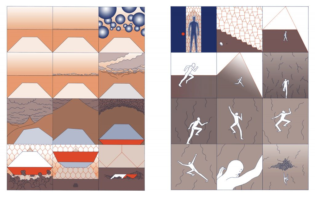
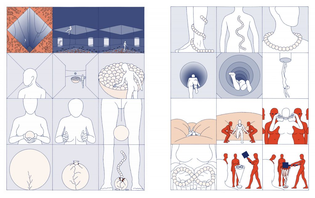
KJ: Your work features a lot of bodily transformations and disembodiment, but they never feel grotesque, gory, or scary. Why bodily transformations and/or disembodiments?
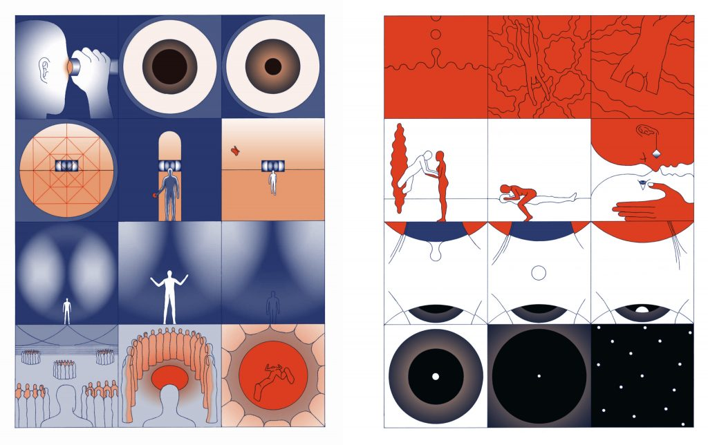
AB: I’m trying to probe the human unconscious. Fascinations always drove me, I love to dig into them. They’re so exciting, strange, deep… I’m fascinated by what we call in french “prégnance visuelle”, which means “deep resonating fertile visual force”. Why are certain forms so “prégnante” for the human eyes/brain? Why are geometric or erotic shapes so strong? These questions lead me to question human mechanisms.
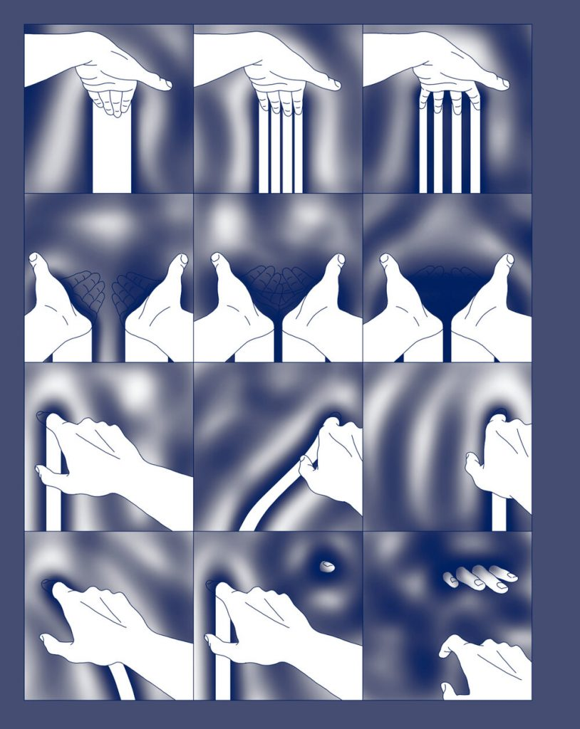
KJ: How does the “texture” matter to you? I was fascinated by how you represented bodies and objects in Interface when I first read it in Gouffre. Similarly, could you talk about the material feelings of Interface and Neba Neba? I’m curious how you represented the 3D-ness of things.
AB: I always loved bas-relief. The in-between of 2D-3D is so interesting. It’s intriguing how shades, giving volume, give such a sensation of reality. While making it, I realized that a slight imprecision of the line is obvious and uncomfortable, but gradient shades are very forgiving and make it more real very quickly.
I think I always focused on perception, how our inner self connects with the outside world through our sensitive receptors (I see them like holes). So, I’m interested in trying to translate different kinds of perception into the comics medium, how something enters in us. I also feel like there is something deeply connected between visual and touch. Visual sensation gives a sensation of space and so also a sensation of touch, like how the eye can navigate in the white blank/emptiness and can grab the extremity of shapes. The eye catches images.
KJ: Related to both bodily transforms and texture, many of these bodies touch, are submerged in, and become liquid. Why liquids?
AB: Life is fluid! 🙂
Again, I look for “prégnance”, and fluids are mesmerizing. Do we have this fascination because we connect it to lush, to life? It seems advertisements for milk/cream/coffee/chocolate/etc understand very well our deep reliance on fluids. I totally love this fluid porn on drink bottles… It’s such smooth erotic feelings. I think this is very close to ads with arousing bodies. We are driven by these deep, unconscious, very physical attractions. Fluid is more fun… and nobody will ever think to censor that!
KJ: I love that your works do not have obvious answers and make readers ask questions like I am doing right now. Do you think about how readers would react/read while you make comics?
AB: Yes. I feel I’m more a reading-designer than a comics artist. I’m always looking for in-between, strange, bizarre, undefined, evocation, ambiguity– and at the same time I’m doing my best to make it very clear and very fluid reading. I love this tension. My motto is : “ligne claire” (clear line) blur.
KJ: Is there any difference in making more minimalist/formalist comics in that/other regards? The stories in this collection have a variety of styles- is this intentional? Does it come from the specifics of each story or is it because they were made at different periods and your style has evolved?
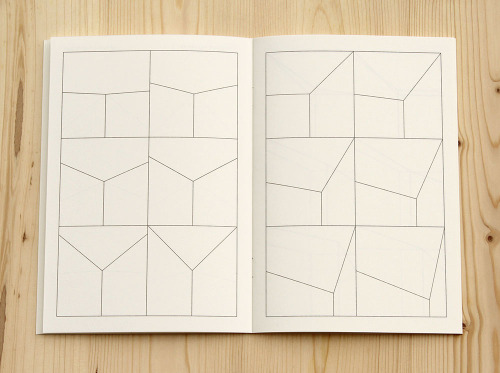
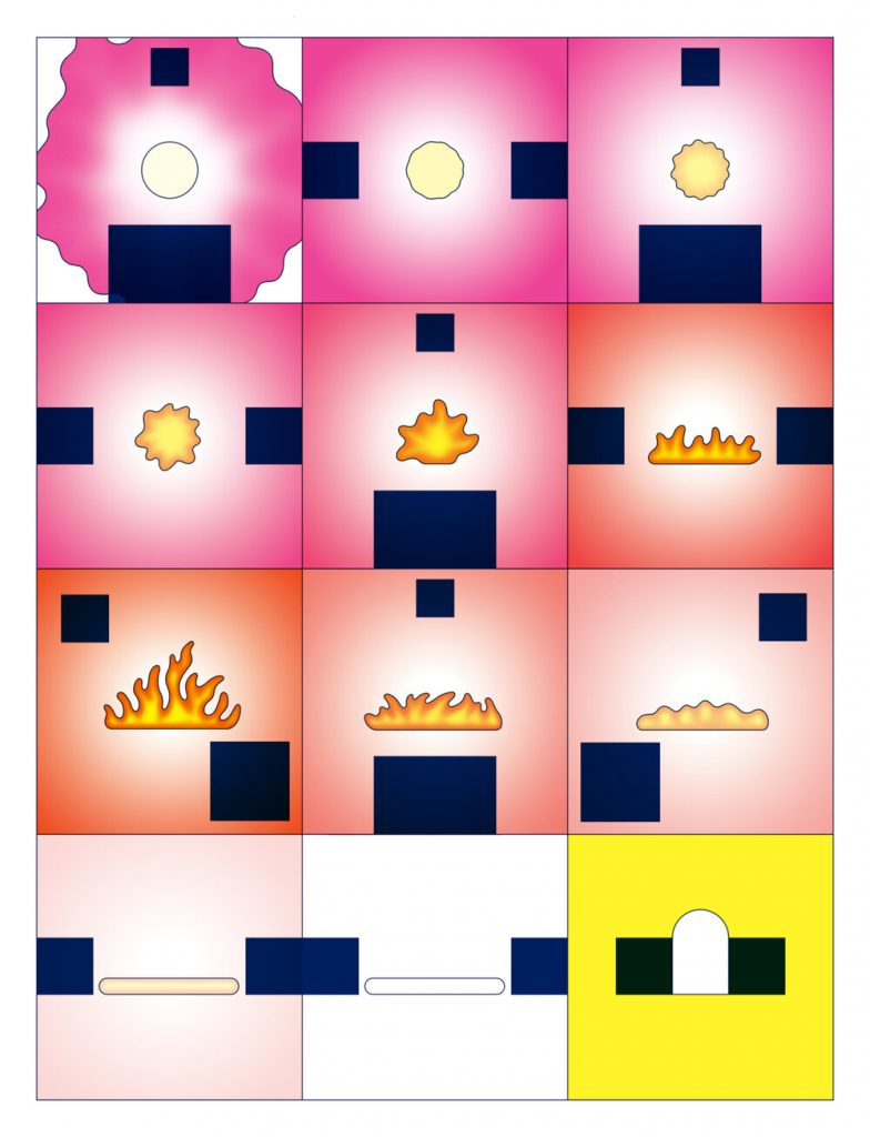
AB: Yes, because they were made in different periods of time and evolved. I kept the 3×4 square panel configuration, with no blank separating panels. These are important choices. Lines of 3 give it more of a rolling rhythm, unlike binary/symmetry which is static. 4 panels, because 3 would have symmetry, and to better fit to a good shape of book. Square, to not have to choose between vertical and horizontal and also because it focuses attention in a specific way. I love square photographs. It leads to “imagier”, to symbolism. I like to think of panels like language unity. As well, to never stray from this organization is a stimulant constraint for me.
KJ: Some of the works in Freefall have distinctive contrasting colours (such as Vicious Circle) while some of them are more subdued. How do you approach colouring in your work? Some of the works collected in the book were published in risograph and others were not- how did you orchestrate different printings and colourings when collecting these works?
AB: I self-printed almost all of them on my risograph press. I worked on it like in the old days when artists (or printer employees, with the artist’s instruction) had to make black and white transparent sheets for each colour of the CMYK printing. That’s why colours had to be simple tones like pure 100% inking (for example, “Smurfs blue” is 100% cyan) or a combination of 25/50/75% pattern dots (from pattern dots sheets that you cut) to make more subtle colours. So, I’m making things like this, but nowadays with computers and specific (risograph) colours. I make one black and white file per colour (in photoshop), and then I make them with spot colours applied and all mixed together on another software (indesign). I create a lot of back and forth. I like to have a restrained number of colours and to play with combinations, which is also coherent with this printing technique.

The Breakdown Press compilation will be 4 spot colours offset printed and I cheated a bit to have more spot colours. In risograph, the gradients were more organic with the vibrant risograph pattern dots but I like that the offset book will look different. The gradient will be more smooth/cold, and the paper is coated unlike the self-published risograph booklets.
KJ: How is the self-publishing world in France? Is it sustainable? You have also participated in international art book and comics fairs, like Printed Matter’s New York Art Book Fair. Do you find the self-publishing/indie/art book/risograph scenes in North America and France similar?
AB: I love the generous spirit of the community. The books are usually very affordable, even if they took a lot of effort to make both the content and object. Nobody is here to make money (haha, it would not be realistic!), you have to be dedicated. It is a very free and creative scene. I love the mix of approaches and I think the comics medium found new brilliant forms in this scene, ones not dependent on publishers- so not dependent on mass appeal. The internet also helped a lot to make this niche international, a good result of globalization… Self-publishing (and serialising) was great for me, I was free and I met many interesting artists at fairs around the world. And today, almost all of this publishing work finds a different/wider audience through compilations by publishers (2dcloud, Matière, Breakdown Press).
I can’t say there are differences between Europe and North America, it seems like an international movement to me.
Hopefully the fairs will return soon.
KJ: Do you plan to keep self-publishing your work first?
AB: Today, I have contacts with publishing houses, often friends, so I feel I could go directly to them. Self-publishing demands a special energy…but if nobody is interested, I will definitely make it myself.
Printing and making your own book is also the best way to control every aspect and be happy with the result.
KJ: Finally: any future projects for Beauclair fans?
AB: I’m in a break time from drawing. I needed it. I’m very busy with other stuff, like taking care of our baby and more local projects such as creating a nanobrewery (a new passion) and working with friends on a community café in our remote south of France countryside. It’s funny, I was thinking I was dedicated to comics for life but today I really don’t know if I’ll make comics again. I think I’m now more attracted to more minimal art forms, like children’s books,drawing series, wooden toys/volumes.
I think it will take a little while to have enough time again for this, and to share… See you there!